Is it a Colour combination? White space? Style? Great art?
For me it is all these things and none of them sometimes. It is something else, that “Je ne sais quoi” that melds advertiser, media, message and observer.
MarshalI McLuhan (great Canadian Philosopher, look him up) said, “the media is the message.” And there are times I see this more clearly than others and other times I work on the instinct that this is true. As a result it is more difficult to work for someone I have never met. There are times when this is necessary, say when you are working with big corporation, or you are doing third-party artwork for a client of a client, but in general, I like to meet my clients: “the advertisers.” Hopefully clients can tell me their message, how they want it delivered (print, web, signage or vehicle-wrap) and whose attention they want to capture with the message. Armed with this information I set out to deliver a client-based unique design that delivers an impactful message to the intended audience.
Are there rules?
Sure there are and they apply most of the time. Would I use Disney Pink (Pantone 241) to market beer to truck drivers, probably not. So colour matters, as does shape, font-style and overall layout. The main point though is: get the message across, quickly and without ambiguities. Lots of copy might work if you are sending out an annual report, but too many things on a business card or vehicle-wrap just muddies the message.
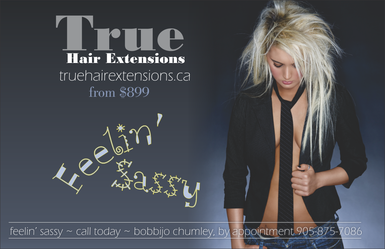
 KISS – keep it super simple and a picture is worth a thousand words are great things to keep in mind. There are a plethora of stock image sites, some of them free, which offer high-quality, low cost stock photography that can help to get your message across. Using stock photography showing a model that looks like your intended audience, or looks like how your intended audience wants to look, is a great start, add a tag-line that drives home the client’s message like: “we are the best”, ” your life will be better if…” and a “call to action” which can simply be contact information, or “enter contest”, “redeem coupon”, or whatever the client wants the observer to do. Add the logo and you are done…
Logos: Pictures are generally not good in logos because they are raster images (made up of dots) and usually look like they are made up of dots when you blow them up to print on a sign. So logos need to be a vector image, which means, for the most part, somebody drew them using lines and fills. Graphics programs will blow up vector images to billboard size without loss of image quality. The next thing is that the same logo must work, if printed in a single colour on the corner of an envelope, i.e. 0.75″ high. Coca-Cola is such a beautiful example of something that will work in one colour on the corner of an envelope and can be blown up to 15 stories high and still retain its integrity as a visual symbol.
So you have a colour palette, a picture that conveys emotion, a tag line, a call to action, and a logo. So go ahead and lay it out. This is where the rules really come into play. Think first of overall impact, will the intended audience stop and look or will their eyes just slide on by. The silhouette of a teen on a skateboard wearing an iPod comes to mind; grandma’s eyes don’t even recognize what it is, but every 16-year-old on the block gets it! Choose a font, something avant-garde (every generation thinks they are avant-garde, even if they don’t know what it means). Make the message clear and small (because young eyes see everything). And lead the eye to the call to action…”own one today” or whatever. Use the logo as a counterpoint to balance the design. Voila great design.
I got a little off track in the paragraph above because the design was building as I was writing, but it does illustrate a design to an intended audience. Obviously if we were marketing to grandma, the picture would look like her, the colours would be different, the tag line would have to be bigger and plainer and the call to action would be more traditional…”available at The Bay.”
The 2 things that would remain constant in the 2 above examples would be balance and white space, not necessarily white, just space with nothing in it. Designs have to balance; they have to have flow, and the appearance of movement for the eye to follow. This is partly accomplished with empty space, because over-crowded designs draw the eyes in too many different directions.
In closing, Feel your client, who are they? What message do they want to send? Who is the audience? What action do they want from the audience? Choose colour, fonts, and pictures and lay it out so there is interest at a glance, a clear message and call to action, with flow and balance in the design.
ajust loved the article
Really quite interesting. Never knew so much “thought” went into to printing. Thanks for the education.
Thank God you have a new picture of yourself!
Ken
Great blog Steve! Often we know what works when we see it, but don’t know why. It’s great to have more information. I love your work too.
Thanks Palmer, that means a lot coming from you.