
Web design using big picture backgrounds quickly allows users to know who you are and what you do at a glance. This design methodology does not lend itself to all web applications but when an emotion has to be expressed or a flavour has to be conveyed, then big pictures are the way to go.
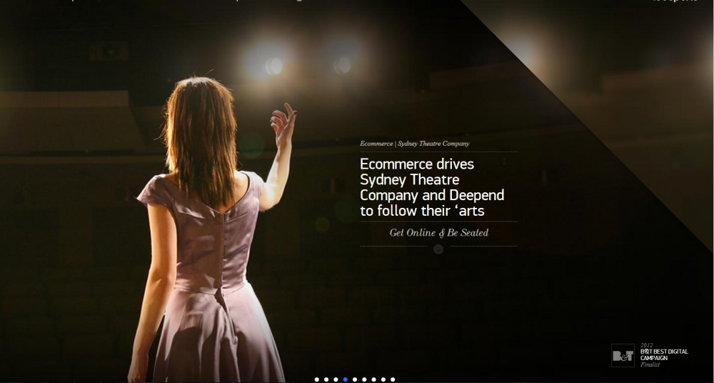
The Sydney Theater Company
Quickly lets you know you are somewhere for the preforming arts, it also conveys the emotions involved around live performance – costume, lighting and gesture are all brought to your attention in a millisecond. The words placed beside the figure of the woman draws the eye to a simple message. Mission accomplished, the user knows she is in the right place and will probably explore further.
Choosing the right picture
“If a picture is worth a thousand words then for your own sake choose the right picture for your home page.”
I thought this post would be easy, find a bunch of beautiful websites that use large image backgrounds, do a short critique and move on – not so Batman! At this point I have looked at about 30 websites with large picture backgrounds, and many of the picture tell no story, and do not convey any idea of who the company is or what they do. A case in point is below:
Wildcat
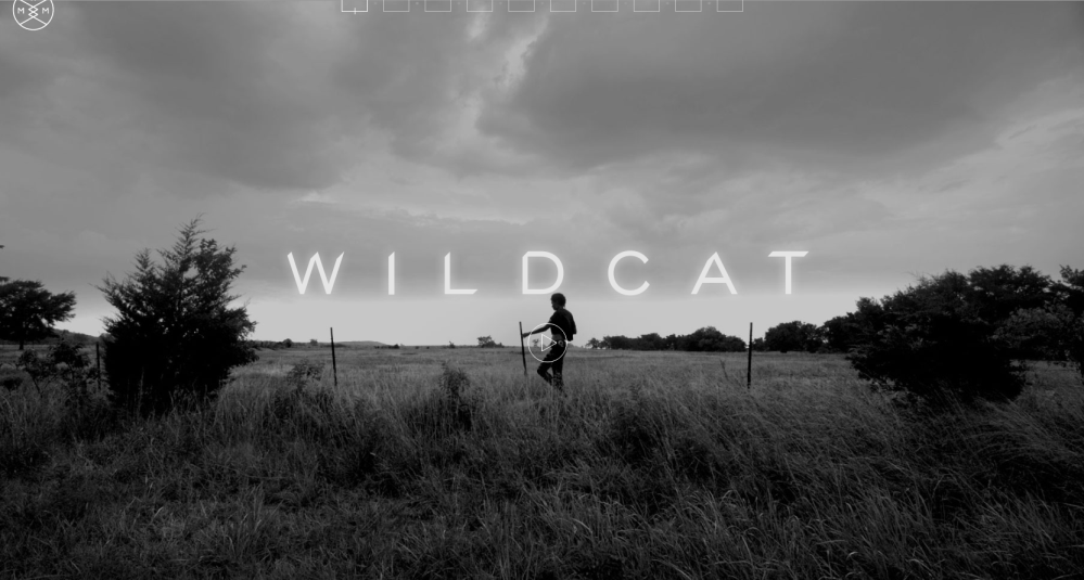
Above we have a guy hiking through a field, and the word Wildcat. Also you can notice a play video button. I give the guy the benefit of the doubt and play the video. I watched for a full minute, and still did not know what the site was about. Is it an adventure holiday, a film about wildcats, I dunno.
So onward with some better stuff
Powderlife
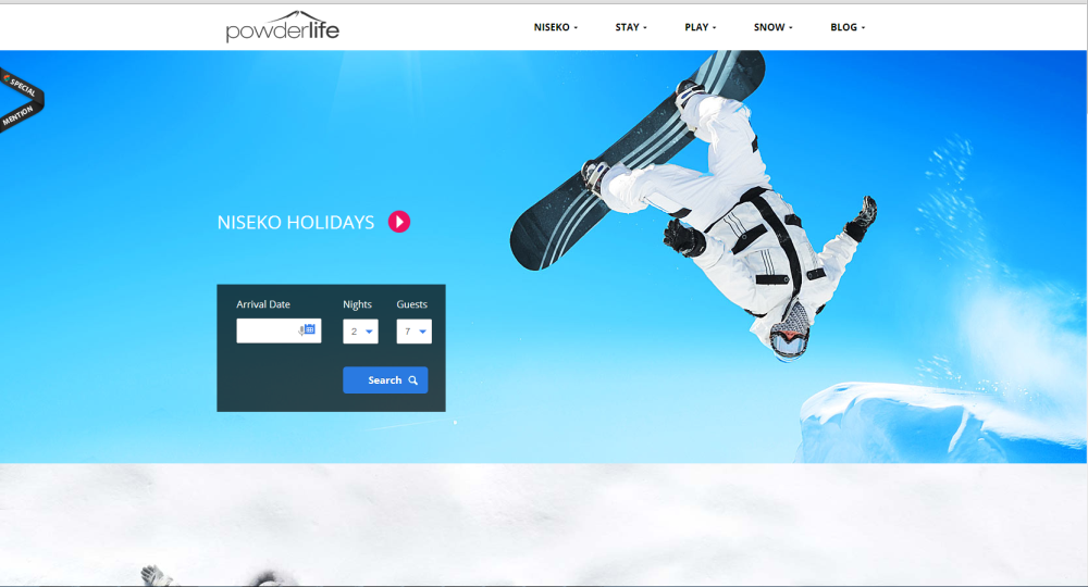
Powderlife is about skiing and snowboarding holidays, this is obvious from the picture the company has chosen. So if you want know something about snowboarding or skiing you will probably enter the site and explore more.
Touch Up Auto Body
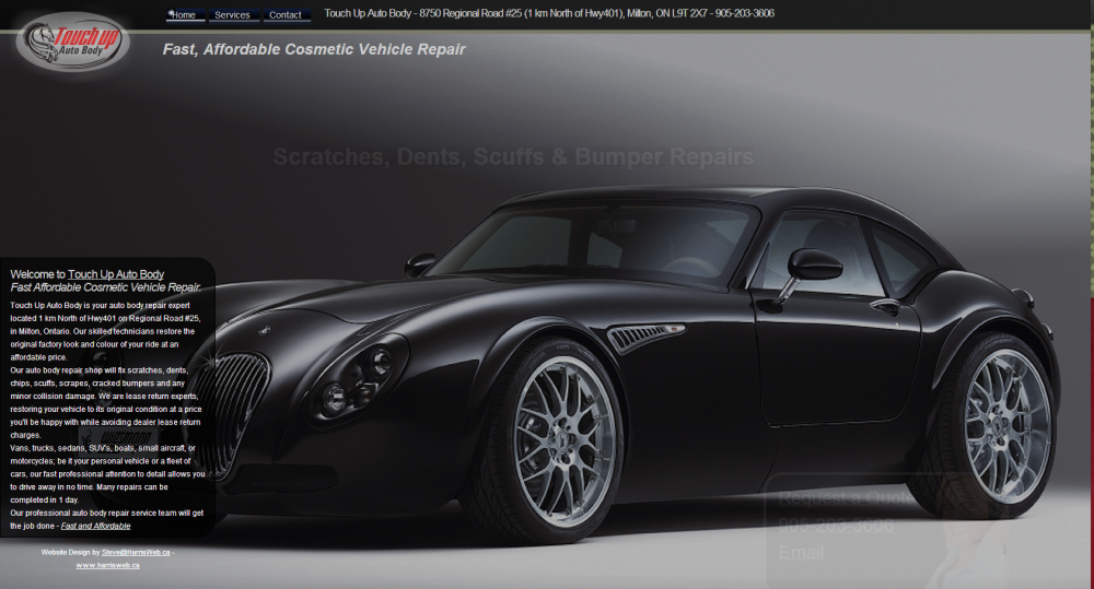
Touch Up Auto Body is one of my sites. As you can see this is an Auto Body Shop and the first thing you see is a car. The tag line is “Fast Affordable Cosmetic Vehicle Repair”. The picture is a car that is out of the price range of many people which makes you look a little harder. It is what I always say, “Sell the Sizzle”
Campanino Gulf Club
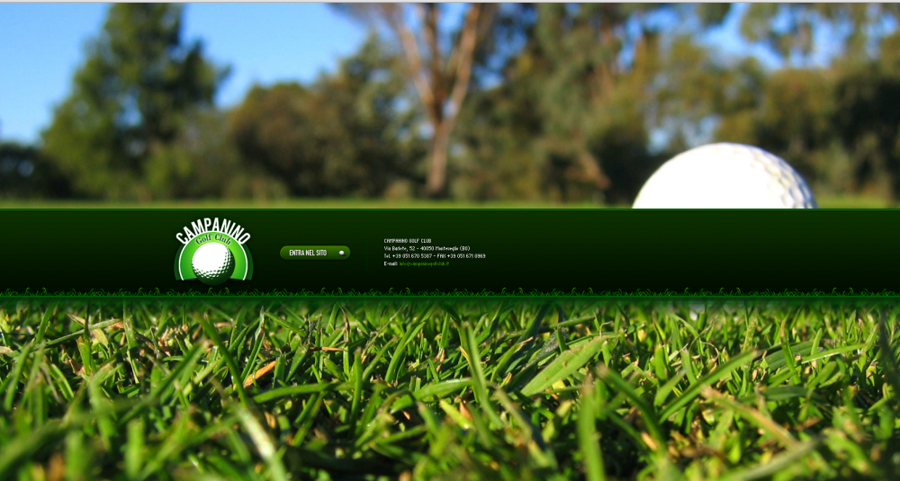
Campanino Golf Club uses a great narrow depth of field shot of a golf ball across a fairway. You instantly know that this site is about golf, and again, if you are interested in golf, you will probably hang around for a while.
Davidia Int.
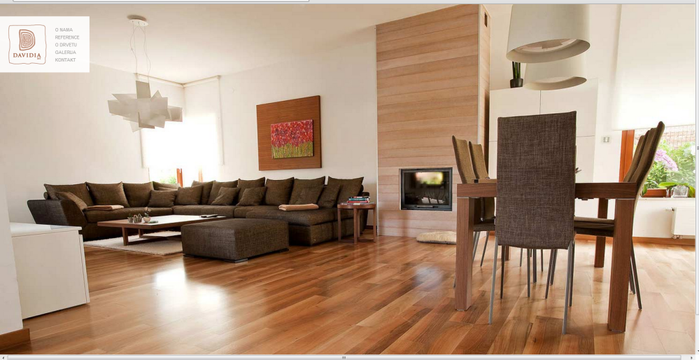
Davidia Int. is interesting because the Google translation from Croatian is not great, so I am still a little unsure about what they do. My best guess is wood flooring, but I am uncertain if they also do furnishings too. Be that as it may, the big picture they choose does lend itself to wood flooring, and interior design, these are often interrelated so no harm done.
So What Have We Learned
Mostly what I learned is that if done well, a big image background grabs the visitor’s attention quickly and conveys the message fast – way faster than words. The surprising thing I learned is that so many companies are doing this badly! I looked at over 90 websites to come up with these 6, and one of them I did myself! If your designer is coming to you with an idea, send a link of a mock up to all the people you know and ask them what they think the picture says to them. Designers are often looking at things from a very artistic viewpoint and you are too close to the forest to see the trees; you see the associations that your customer may not.