Website Design Overview
Website Design Overview – considerations before during and after the build. It doesn’t matter if you are a code monkey who dreams javaScript in your sleep and eats PHP for breakfast or you are a small business owner struggling through WordPress, many of the concepts are the same – you want to connect to people!
There are 571 new websites created every minute according to The Daily Mail and only 10 spots on the front page of Google for any given search, that’s a lot of competition! Fortunately There are about 2.4 MIllion searches done in that same minute (Internet Live Stats) so there is hope.
Google serves up search results based on its algorithm which takes into account some 200 different factors; some of the most important are keywords and user behavior, and this is where I will focus today.
- Keywords are the words a user enters into a search box to find what they want
- User behaviour is what users do once a search engine results page (SERP) is served up to them.
So what I want to explore is based on keywords, what makes users behave in a way that is beneficial to your company.
Keywords
Keywords are the backbone of search. You may have read that keywords are dead, what that means is that a keyword strategy, used to manipulate search engine results, is dead. Today keywords are sign posts, signals to search engines and users alike that something lies ahead if you go down this path. So rule #1 is:
Tell the truth with your keywords
because if your lie about what your website is about, then users will be gone in the blink of an eye, never to return. In this, you have done yourself great damage, so don’t do it.
So before we start into designing our website we must define who we are and what we do. Once that is complete, we need to find keywords that describe who we are and what we do. I do not want to get into a deep discussion about keyword research, you can read this post about How to do Keyword Research in the end you should come up with a list of keywords to use on your webpages.
Navigation Menus
Location and Structure
Navigation is a very important part of your website as it divides and groups your webpages into conceptual groups. Navigation menus should be easily found and methodical in their structure. Most times navigation is found across the top of a webpage or down the left hand side. For large sites navigation can be in both places, using an across-the-top menu for broad concepts and changing the left menu to be specific to the webpage on which it appears. This allows you to define narrower concepts fully without cluttering the all the pages with tons of menu links. It also allows you to control the flow of “link juice” to your most important pages.
Keywords in Navigation
Keywords do not have to be used in navigation but, the ideas that the keywords represent should be reflected in the navigation structure you use. There was a tendency to be “cute” when creating menu titles, but I am of the mind that top-level menu links should be broad in scope and descriptive of what is to come. Second-level links should be grouped by concept and displayed under the broader top-level link.. The same goes for the third-level links, they should be grouped, by concept, under a secondary links. Forth level menu links should not be used. If you require a forth level link, then your top-level links are too broad and need to be broken down in to two narrower focused links so that no concept goes beyond 3 levels. This idea is represented in the image below.
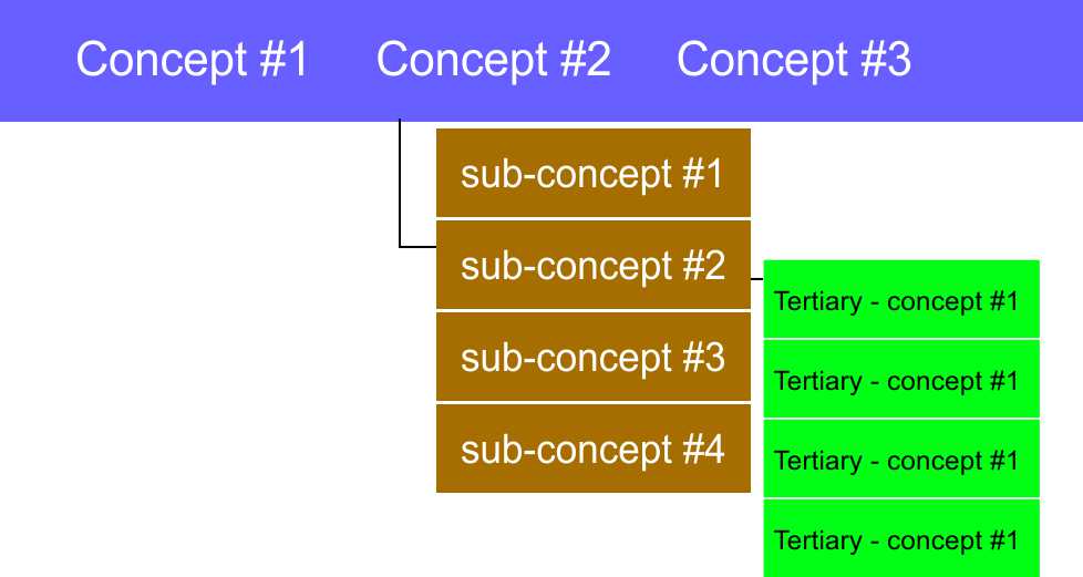
So once the keywords are chosen the concepts they represent should be gathered into groups of related concepts and the menu structure should follow from there. The flow should be from the broadest concept in the top-level links to the narrowest concept in the third-level links. What the customer expects to find by following a link is always the most important concept.
Menu links should always take a customer to where they expect to end up and concepts should be broader at the top level and focused as they move down through the menu structure.
Above the fold
Above the fold is a newspaper saying meaning the most visible part of the printed paper. This idea comes into play in website design because we have very little time to get the idea across to the user, “You have come to the right place.” If the user feels they have come to the right place, they may stay, click a link, read your stuff and maybe buy something from you – this is the point of having a website. If the user feels they have come to the wrong place, then they are usually gone in less than 3 seconds. So what is above the fold must be simple, eye-catching and elicit and emotion.
Two reasons to elicit an emotion with above the fold content
- Women listen to their emotions more than men do and women make 80% of all household purchases
- An emotional response can fix an idea into memory better than logic can.

To illustrate this concept I have 2 pictures of the same young woman. In the left picture the woman is looking at a laptop, smiling, relaxed, holding a warm drink, looking satisfied and happy. Whereas in the picture to the right, the same woman is looking tolerant, clearly not enjoying whatever is on her phone, or the phone itself. The point is that you can pick all that up in micro-seconds by looking at the pictures but it took a few seconds to read what I wrote.
Connecting the Concept to the Image
Each image could be used to connect an emotion to an idea. The left picture could have a captions like:
- Learn from Home – to promote an online school
- Shop Happy with ACME – to promote an online shopping site
- Work from Home – to promote a home based business model
While the image on the right could say:
- Time for a New Boyfriend? – to promote an online dating site
- Time for a New Phone? – to sell mobile phones
- Time for a Holiday – to promote a travel agency
Each image conveys an emotion and along with a simple message can conveys an idea very quickly and that idea is: You have come to the right place!.
Examples of Connecting to Audiences Quickly
Udemy an online training/education webstie https://www.udemy.com/ uses a slideshow of 2 images, the first of a young female studying her phone and the second of a slightly older teacher writing on a clear board. The centre of the image is overlaid with a prominent box reading “What course will your life take?” a clever play on words. Also there is a search box prefilled with “Find a course on virtually anything” another clever play on words.
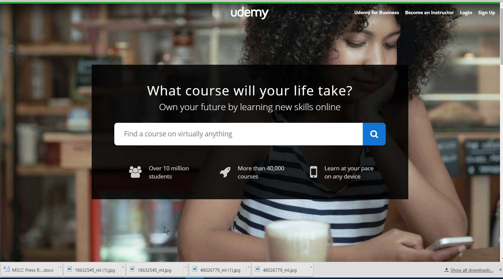
Udemy online learning site connecting quickly to its audience
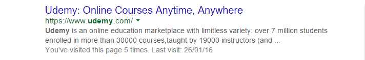
The designers have chosen the images to reflect the intended audience and the words are offering something the audience wants. For interest the rich snippet in Google is shown below, so users clicking the link in Google are taken to a page that reinforces the idea presented in the rich snippet.
Queenstown Regenerative Medicine is a site that I designed – http://www.queenstownrm.co.nz/ – as in the example above the picture takes up the whole screen. You will have to click through to see it but, it is a video background of a middle age couple, she is turning to face him, and they are both smiling. They both look their age, but healthy and happy. The caption reads “Stem Cell Regenerative Medicine” so there is no ambiguity as to what the visitor will find. Also there is down arrow indicating there is more below the fold.
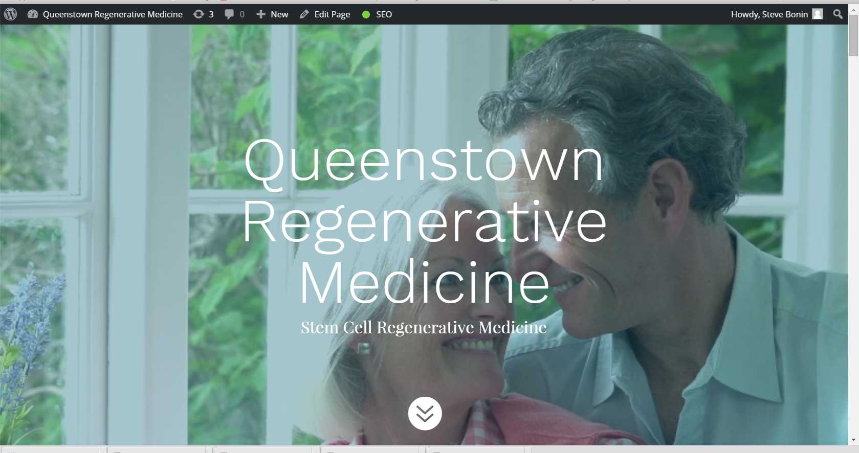
Queenstown Regenerative Medicine’s main audience is middle age couples who want to stay healthy
In this last example we see how apple http://www.apple.com/ has purposely not used up the complete screen height for their image. The image is large but what is below the fold, peeks out from the bottom of the screen, showing, “there is more to see below”. Apple has also done another thing differently, they are not reflecting the audience here, they are showing what the audience wants to buy. They reflect their audience in other media advertising, so when a visitor comes here, they see what they want.
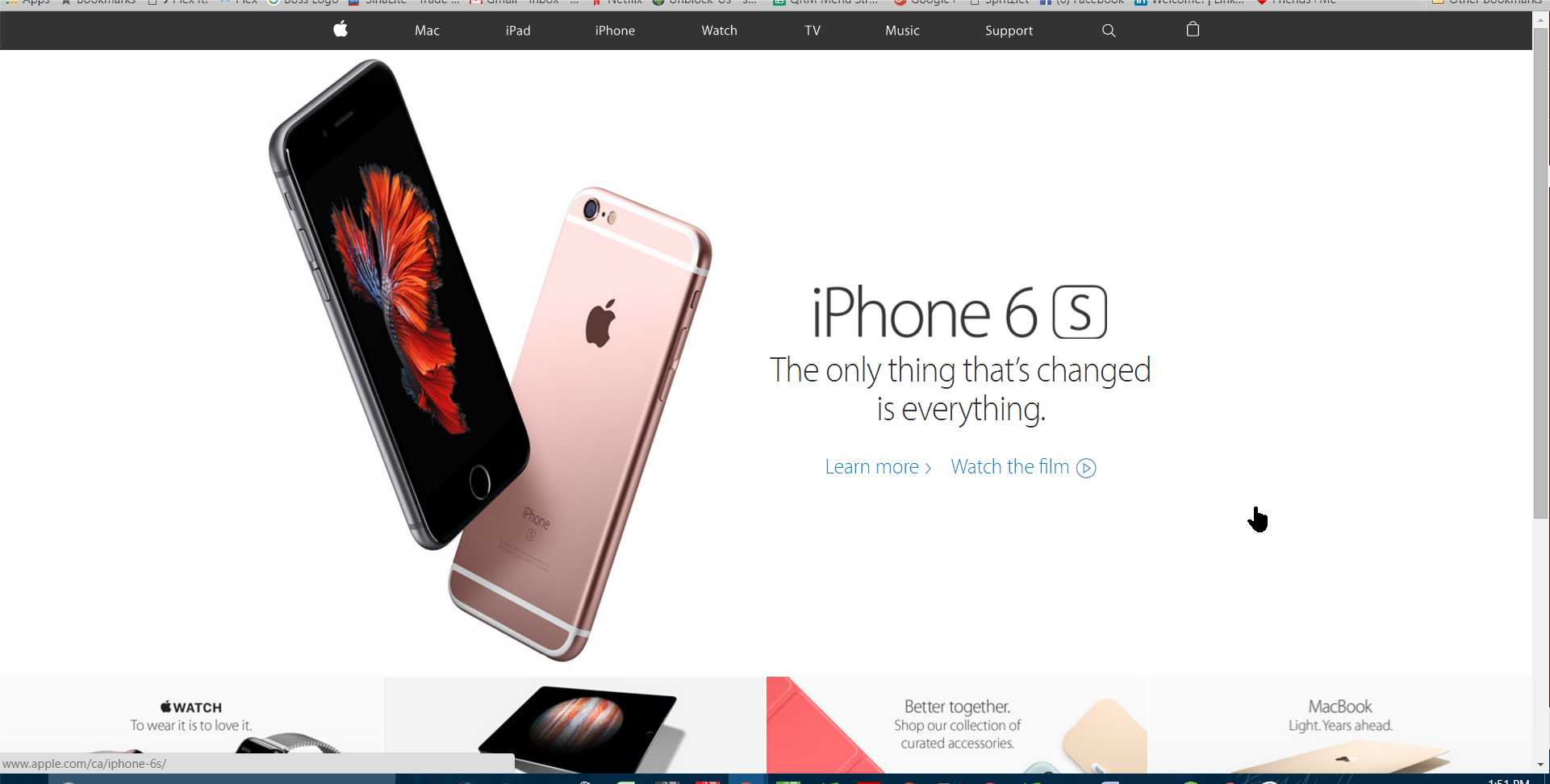
below the fold content peeks out
Below the Fold content
There are many things you can put below the fold once you have your audience’s attention, much of it will depend on the type of business you are running. In general you want to give the visitor what they are looking for. In the case of Apple, above, the page is full of bite-sized specs to woo the visitor to want this phone, or even buy it!
In the example of kmbvaservices http://www.kmbvaservices.com/ what is pictured below is below the fold, once you get past the big “I do Virtual Administrative Work” splash above the fold, you scroll down and find out exactly what Kimberly does. There are blurbs about Getting You Organized, Doing Research & Presentations and doing Social and Blog posting. Maybe these are the services you are looking for in a VA, so you have probably found a good fit. Further down the page you will find additional services and a call to action to contact her.
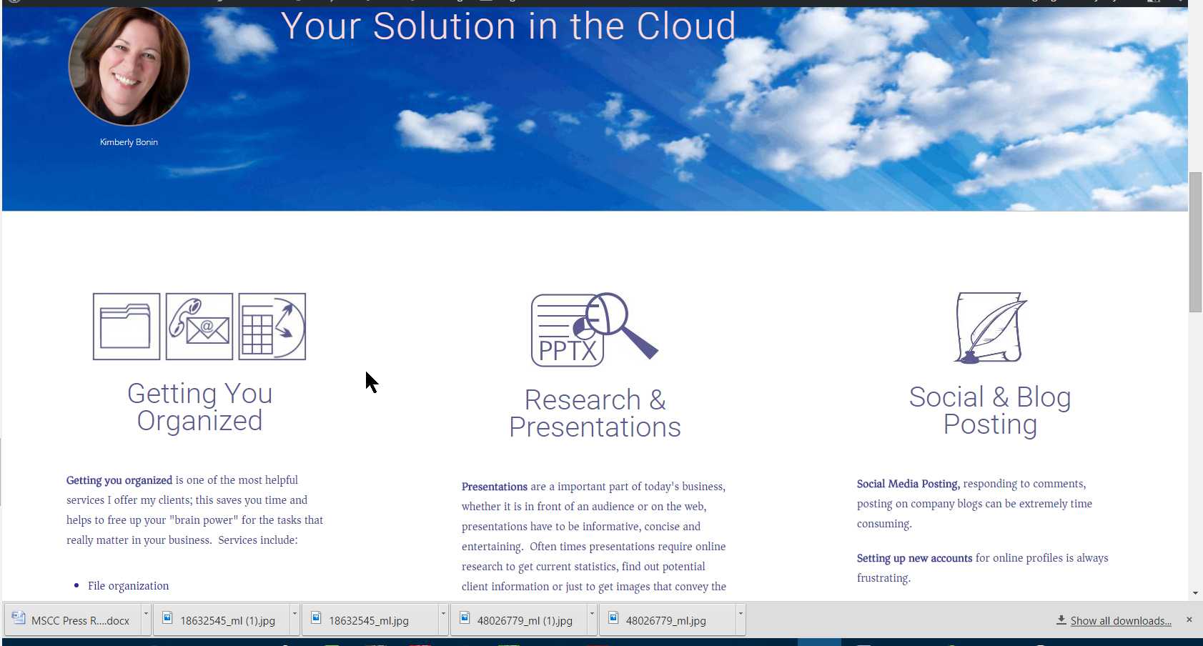
These are all good things to have below the fold, they relate to the concept presented above the fold and expand on it and give a call to action. When implementing Google Analytics it is always good to have a call to action because you can set up and event and measure response to it.
Sizing Your Content Blocks to Show Below the Fold Content
Allow me to get a little geeky and code monkey on you for a moment. If you are using WordPress or another CMS you usually only need to tell the theme that this block should fill the screen, and it does. But if you are coding by hand, or you want your above the fold content to be a percentage of the available screen height, the code below will help you do just that.
The Code Explained
We start with a block called #hero and set the attributes as we want with a width of 100% and a background image. The javaScript first measures the available height and width, set the height we want to be 40% of the available height and the image height to 90% of that. We then calculate the x/y ratio.
If the ratio is greater than 1.77 ie, it is probably not a 16:9 screen, then we make some adjustments to set the height to 60% of the available height.
Then using getElementById we set the Div height and the image height. And we finally place the logo (logoblack.png) centred over the background image.
<style>

#hero{width:100%; height:auto;border: solid 0px #c0c0c0; background-image:url(images/bg-hero.png); background-size:100% 100%; background-repeat:no-repeat; overflow:hide; }

#heroimage{display:block; margin:0 auto; padding-top:25px;}

</style>
<script>

var yheight = (window.screen.availHeight);

var xwidth = (window.screen.availWidth);

var heroy = yheight * 0.4;

var heroimagey = heroy * 0.9;

var screenratio = xwidth/yheight;
window.onload = function() {
if(xwidth > yheight){
if(screenratio > 1.77){
heroy = yheight * 0.6;
heroimagey = heroy * 0.9;
}
document.getElementById("hero").style.height = heroy +"px";
document.getElementById("heroimage").style.height = heroimagey +"px";
}else{
document.getElementById("hero").style.height = heroy +"px";
document.getElementById("heroimage").style.width = "90%";
}
}
</script>
<div id="hero">
<img id="heroimage" src="images/logoblack.png" alt="Touch Up Auto Body Logo in Black" />
</div>
Using this code we can always control the height of the above the fold content and thus how much of the below the fold content will peek out at the bottom of the screen. This can be very useful. You can see this code in action here: http://touchupautobody.com/ or click the image below.
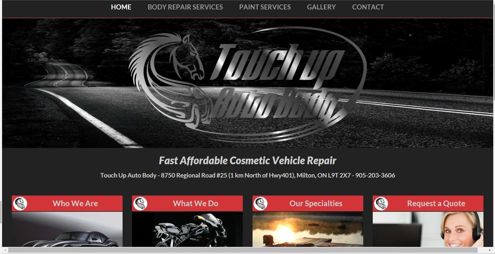
using javaScript to fix the height of above the fold content
Different Layouts and Styling Elements
Line Length, Line Height, Font Size and Column Layouts
Line Length and Columns
There are 2 considerations when choosing how many columns to break your content into. The first is line length, 45 – 75 characters per line is considered optimal for reading, more than 75 causes the reader to move their head or it may cause them to lose the beginning of the next line, causing frustration and fatigue. Line lengths less than 45 characters break up phrases and the meaning may be lost on the reader, so always strive to have line lengths in this range.
The second consideration is responsive design, which I will cover in more depth below, but basically when your webpage is displayed on a narrower screen, the paragraph columns are stacked on top of each other starting from the left column first and will most likely be resized to all be the same width.
Another consideration when breaking up your content is that readers often read only the first sentence of a paragraph, so if you break you content into more columns, a reader may read more of what is written.
Line Height
As to line height, readers find it difficult to read lines too close together, their eyes will drift from line to line. If lines are spaced too far apart, readers often loose the beginning of the next line because it requires too much eye movement. I often use line heights of 150% to 170% for regular text. When I do a blockquote I like to make the font bigger and close the lines to 120% to 130% depending on the font I am using.
Font Size and Colour
There is a trend toward smaller fonts right now because they look better in blocks on a page and you can often express a complete idea in a small block. There is also a push-back trend to larger plainer fonts amongst some bloggers who feel that with an aging population, they want to make it easier for that over-45 crowd to read their stuff. So audience is a consideration. If you site is to appeal to teens, then often smaller fonts are great, but if you are selling meds to seniors, 14px is the minimum I would go.
The same goes for colour, the trends to light blue text on grey backgrounds is difficult for many people to read, especially long passages of text. I like to make text black, or #333333 grey. Dark blue and green work well also. Contrast is important. Remembering that most men become colour blind as they age, red text on a green background would not be a good choice to sell to senior men. Looking at the Viagra website for a moment, below
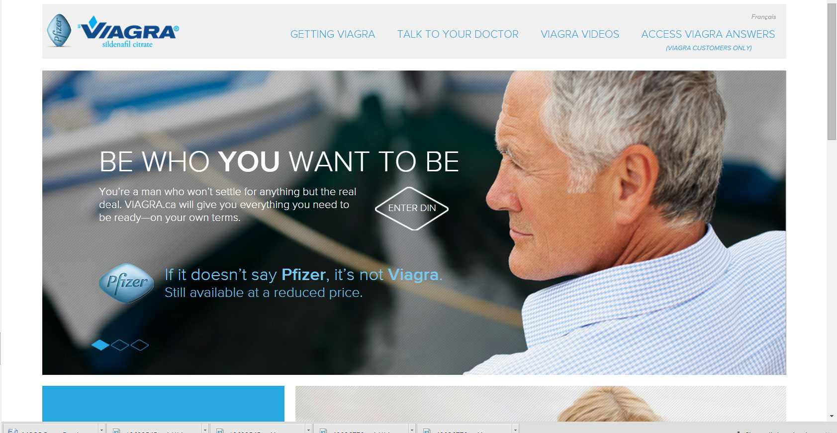
Viagra, an example of easy to read fonts
We know this page is geared toward men over 50. You can click through by click on the image. What we see is the smallest font is about 16px and much of the page has 30px type. the fonts are plain and have a line height of about 150%.
Colour Pallets
There are a few rules of thumb when it comes to colour and again we will look at the intended audience. Everyone likes blue, though there are some cultural differences to consider. In North America and Europe we associate blue with business and green with health. In Chinese cultures red is representative of prosperity or expansion, but should be used sparingly. Green, in Chinese culture, is used to represent “clean” or “uncontaminated”.You can read more here: For a fuller discussion on Colour in Chinese Culture
In European cultures blue is a desirable colour. Men prefer blue with little red in it and stronger colours we could define this as men preferring stronger warmer colours. Men also do not mind achromatic colours like black, white and grey.
Women prefer blue with a little green in it and prefer more pastel shades, women also notice finer degrees of colour, so we could say that women prefer cooler colours and notice finer detail in colour variation. Women also do not like achromatic colours.
These are general rules of thumb, for a fuller discussion on colours on the internet read Kissmetrics’ True Colors – Breakdown of Color Preferences by Gender
Shapes and Layouts
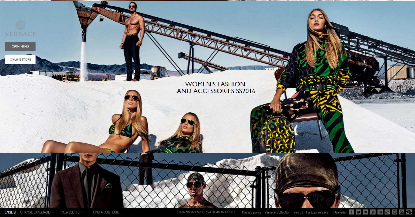
Men and women also differ in their preference for layouts. Men’s brains have divisions, like little rooms they keep different things in and prefer layouts that are ordered and have clean lines delineating topics. Women, on the other hand, have brains that are more open and fluid. Women prefer layouts that flow, no borders between concepts, one flows into the other.
To illustrate a site designed to sell to women we can look at Versace women’s fashion, below we can see how the images flow outside the borders and are of irregular shape. The sky background has been changed to a blue-green RGB (148,183,202) and (58,84,109). In this case the designer has not tended towards pastels, but could have.
An example of a webpage more geared to men would be Ram Trucks. We see below that the contrast is high between sections and the below-the-fold-content has borders on the divs. The pictures below the hero image are ordered, the same size and equally spaced apart. Most of the background colours are grey.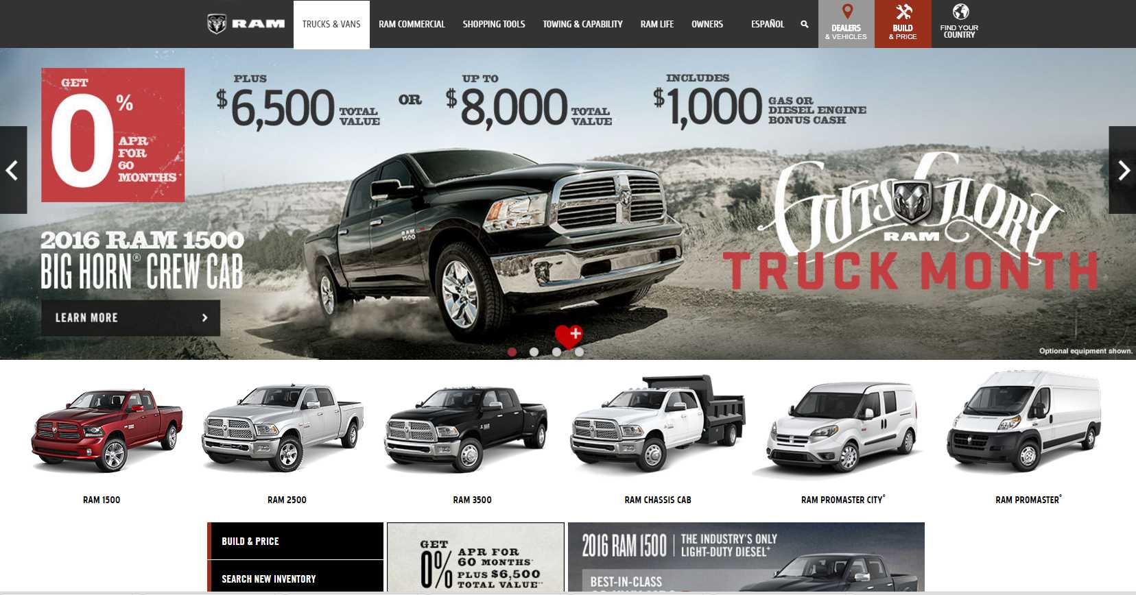
Synopsis
- Connect to your audience quickly and images are a good way to do that.
- Images convey meaning, so choose them carefully
- Navigation should be well planned to bring readers to finer variations of concepts
- Fonts and styling are important so spend some time getting it right
- Colour, Shape and style are different between genders.and cultures
I hope this helps you to understand the elements of website design better. To see more of what I do, my main webpages can be found at www.harrisweb.ca