I remember a radio interview here in Toronto a few decades ago with an owner of a successful Steakhouse, who was opening a new location in downtown at the time. I remember her talking about how her steak was as good as the other steakhouses established in North America at the time and how her decor was as good as any, and her pricing equal to that of her competitor’s but when the interviewer asked her, “If it is about the same as everyone else, why do your diners rave about how good it is?”
I swear I could here her smile on the radio as she answered, “Butter.”
“Butter?” queried the interviewer..
She went on to explain that they served steaks on a hot iron plate inlaid into a wood surrounding. At the exit to the kitchen was a huge tub of butter and every waiter and waitress was instructed to throw a tab of butter on the side of the hot plate as they exited the kitchen. This would merrily sizzle loudly as the waitress carried the plates through the dining room, engaging the senses of all the diners, sight, smell and hearing – priming diners for taste when their meals arrived.
It truly was – Selling the Sizzle – most literally. Today we might call this a unique selling proposition.
A Different Kind of Sizzle
My wife and I were sitting on the couch the other night and she was relaying a story to me about telling a young co-worker how are granddaughters love the game Trouble. I started to recite the commercial from our youth, “Have you got trouble, wait don’t run, this kind of trouble is lots of fun” and she joined in and we recited the commercial verbatim to its end. If you are in your 50’s right now it is probably running through your head…leave a comment below if it is…the 30 second spot is below if you are not familiar.
The commercial successfully illustrates the emotional appeal to both children and adults of “emotional sizzle” If you don’t think so, just think that my wife and I both, and possibly you, can recite this commercial 40 years later and my wife bought the game for our granddaughters to play.
Using Large Background Images
One way to make an emotional impact is to use large background images that embody the message you are attempting to transmit. These images must be chosen with care.
- They must convey the idea
- They must connect to the audience
- They must not interfere with the text message
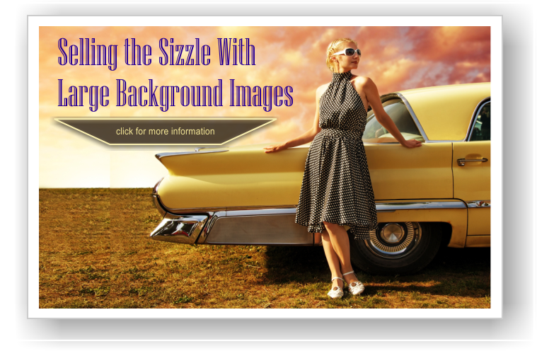
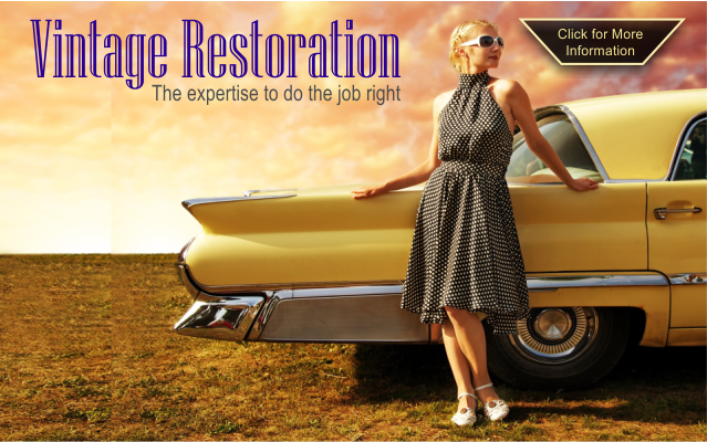
Here is a website I built for a local auto body shop.
Unfortunately the website has been redesigned in a completely different direction so this one is from my archive, without the finishing touches. If you take a look the first thing you will notice is there are no before and after pictures as you usually find in this type of website. What we are selling here is the finished product, what you will drive away with. Throughout the website we use “romantic” images, like the tail-fin of a 1960 Cadillac and the 1950’s styled young woman leaning on the yellow ’55 Ford – both are selling, romance – Sizzle! And your life can be this cool.
“It works”, is not enough
The web grew up with left-brained, linear thinking, geeks, of which I was one, because HTML looked a lot like programming. Today this is still very true, but today’s new-branded geeks have been exposed to the likes of Apple, who’s designs have driven markets – remember the iMac colours. The market today is telling us that it is not enough that things work, they have to be stylish and work at the same time.
Ultimately Design is for Humans
Design is about engaging more than just the cerebral logical side of the brain, it is about appealing to the senses and the more you can do that the better your message is conveyed to the viewer. That being said there are also other considerations when choosing images that will connect to the intended audience.
Contrast
Images, especially background images, must be chosen to have a “uniformity of shade” at least in large regions of the image so text or other elements show up against it. The good news is that good images usually do not place key parts of the image in the centre of the layout, they are usually only constitute about 1/3 of the real estate, that leaves a lot of room for you to maneuver your content into. So the key element of the image, that which embodies the emotional impact of the image, is still visible, and your message has a clear space to be placed.
Structure
If the website design is to be successful there must be a call to action. It has to stand out from the background without impeding it and can either be part of the message or separate from it. Below I mocked up a layout that works and I will run through the though process to do so.
Choosing a Large Background Image
The background image was chosen to convey the romantic notion of the golden years of North American automobiles, because our audience are classic car aficionados. The girl is classy, not overly sexy but still appealing; this is important because women can get easily turned off by overt sexaul layouts and not glean the message from the layout. The car reflects the style and condition that our customers probably own, or wish they owned. The image also offers large, fairly homogenous spaces in the sky and in the grass, both places our message could be placed.
Placing the message
In this case the message is simple, “this is who we are, this is what we do” The name in many ways tells the reader what we do and because of the image, the audience is going to assume that we restore cars, not coke machines. The sky, in the top left was the obvious place to put this. It should be noted the image originally faced the other way and I reversed it so I would have the top left to use like this.
Adding the Call to Action
I played with where to put the button to click, under the tag line, under the car, touching the car, but I chose to put it where the woman was looking. It probably fits and looks better between the logo and the car, but the eye is often drawn to where the person in the picture is looking, so I chose to put it there. Also when things are slightly discordant we are drawn to it.
What we have learned
- Selling the sizzle can be part of our Unique Selling Proposition
- That we have to define our audience and play to them
- Large background images can convey a mood and idea quickly
- Large background images must be chosen with care to convey the message but also allow us room to place our other elements for the page.
- Contrast and Structure are important when placing our assets on a large background image
If you are interested in my website design services you can see more here: http://www.harrisweb.ca/website_design.php