This is the second in a series of articles to help small to medium business owners get the most from their websites.
Optimizing a website to show up in search ranking, getting potential clients to click to your website and ultimately stay there and somehow “convert”, is a lot of work, that is best done consistently over long periods of time.
Most small business owners that contact me do not have a marketing budget of $700 monthly, my current entry-level package, to afford my services, nor do they want to invest a minimum of 3 months to see a return on their investment. The truth is that with some education, good organization skills and 2 to 4 hours per week, most business owners can do this work themselves. I am here, hopefully, to provide some of that education.
Website Organization
As discussed in Website Marketing for SMBs – Part 1: Website Intent, Organization is one of the most important factors that will keep users on your website, keep them coming back, and converting them. Most people feel time-challenged and the last thing they want to do is try to figure out what it is you are trying to do with your website – they want it to be clear!
Organization Starts with Identity
First, your company name and the type of business you are in should be clearly visible above the fold. You should also define your overall offering in finer detail if possible, like:
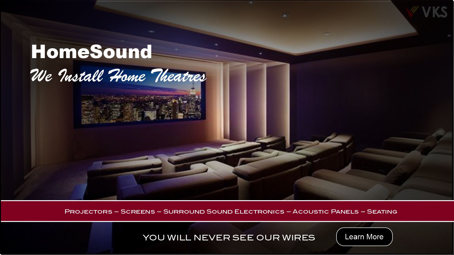
HomeSound
We Install Home Theatres
Projectors – Screens – Surround Sound Electronics – Acoustic Panels – Seating
You will never see our wires
In this example, we have a clear understanding that this company installs home theatres. The second line defines that the company has products and the type of products, including electronics, so these guys are not just carpenters. The last line defines their Unique Selling Point – USP, “You will never see our wires” … so if esthetics are important to you, we’re your guys. So, in very short order we know if we have come to the right place to get what we want. If you are looking to have your basement finished, these guys are probably not your best bet, but if you have a finished basement already and you want it remodelled into a home theatre, then there is a good bet they will do a good job.
What Does Good Organization Look Like
Example:
I was looking for a stonemason to do a small job, probably a half-day’s work. While searching the web I came across many stonemasons who clearly stated they worked on large commercial projects, so I knew not to call them, and as a result I didn’t waste their time, nor mine, making a phone call. I did call 4 or 5 companies that did not state the type of jobs they would undertake, and found none of them wanted a half-day job. I finally landed on a website that clearly stated, “No jobs too large or too small.” I called and yes they would come out and do the work I needed done. As it turns out, this is an underserved niche in the market and they spent one day per week servicing small jobs throughout the Toronto Area. It was easy work for them and it was profitable.
Organization in Navigation
There has been a trend to use ambiguous labels on navigation links in an attempt to be cute or different or whatever. I find this frustrating and quickly abandon websites that do not tell me who they are and what they are offering in less than 3 seconds. It is shown that many people will click away from a website that does not clearly state what their offerings are in shorter and shorter times, in 2021 this is somewhere between 2 and 3 seconds.
When I land on a website home page and don’t know where to click to find what I want…I am gone, and so are your clients if you are not clear.
Navigation Labels
Navigation Labels, technically called anchor text, are the words you use to define where the navigation link will take you. If you have clear anchor text that states “products” and another that reads “services” users have a clear understanding that by clicking the former they will find goods that can be purchased and the latter outlines work they can do for you.
Dropdown Navigation
When you hover over a navigation label often a dropdown list appears that delineates sub-categories of the main label. So under PRODUCTS a pool builder may list VINYL LINER POOLS, FIBERGLASS POOLS & CONCRETE POOLS.
This was an interesting case because searches for “pools” brought up a variety of websites that did not deal in swimming pools, so we had to define my client’s offering as “swimming pools”. Further, my client did not sell DIY installation kits, nor did he supply any products per se. My client only installed or repaired swimming pools, so in the end, we had first-tier navigation labels that read SWIMMING POOL INSTALLATIONS and SWIMMING POOL SERVICE & REPAIR. These labels clearly defined what my client does. We listed the 3 types of pools under the INSTALLATION label, and YEARLY SERVICE and SWIMMING POOL REPAIRS under the SERVICE label. One can see that defining categories, sub-categories and products or services in this way allows users to quickly find what they want or alternatively, know they have come to the wrong place.
Category, Sub-Category & Product or Service Pages
Category Pages group related products or services together. These groups may be groups of products or services, or they may be groups of sub-categories.
Product Pages define and offer information about a specific product or service. These pages have an “add to cart” button in the case of an eCommerce website or, in the case of brochure websites, may offer specifications, options and links to downloadable brochures.
Sub-Category Pages define finer sub-groups of a specific category. These pages really do not differ from Category Pages in any way, they just appear further down the navigation tree.
Navigation Hierarchy
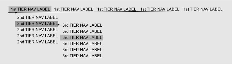
Navigation Label hierarchy
The image above shows how a typical navigation hierarchy appears. Category pages or product pages can be used at each tier with the exception of the final tier, which should always be a product page. As a general rule of thumb navigation trees should not extend beyond the 3rd Tier unless you are selling hundreds of products. Always try to group categories so you can get to the product page by the 3rd tier.
There are 2 schools of thought for attaching category pages to first-tier navigation labels. Many designers feel this is unnecessary because the dropdown list clearly defines the sub-categories. Others, like myself, feel creating a category page for the first-tier navigation labels gives an opportunity to create some content that describes the category a bit, and has the ability to rank the page a little higher. I also feel that users think something should happen when they click the label and when it doesn’t, they get confused.
Breadcrumbs
I have two clients that sell expensive consumable products for industrial machinery, each consumable is firstly defined by the type of machine it fits into, then a specific model of this type. The material is further divided into usage cases and finally into environmental factors which yields between 1 and 5 product pages at the end of the 5th tier of navigation. So sometimes it is unavoidable to have categories beyond the 3rd tier of navigation, but these clients are selling 1000’s of different products, worth substantial sums of money, that in the end, cannot be wrong. As the user moves down the navigation tree they are educated at each step to help them decide what is the best product for their unique circumstances. At each step the user is shown how a better-performing (and higher-priced) product would work better for him.
I cases like the one above it is advised to have breadcrumbs present on all your webpages. A Breadcrumb is a small line of concatenated links that terminate with the webpage they are currently on and show the path to get there from HOME. They generally take the form of something like this:
HOME | Products | Product Category 1 | Product Sub-Category | product page you are on
Images
A picture is worth a thousand words
You have probably heard this a thousand times. It really is true because our minds process images differently than the written word. A picture can not only convey a product, it can establish a situation and can elicit emotion, all in fractions of a second. Let’s look at the example I used at the outset of this article. HomeSound, Home Theatre Installers, looking at the image below we get an idea of what HomeSound can do. A better image may show a family enjoying a movie together, thus defining a situation, but those images are more difficult to source. Lastly, if you are looking to do this in your basement, this image will give you a warm feeling all over – positive emotion. Choosing images should be done carefully because they can say a lot about your business.
Defining Website Identity
A bit more about images…
Images have 3 attributes:
- Alt
- Title
- Caption
The alt attribute is there to help screen readers and visually impaired clients understand what your webpage is about. Google reads these alt attributes to understand what your image is about. I structure my alt attributes like this:
image description – keyword | companyname
so the alt attribute for the above image is : Home theatre installation in Etobicoke, Ontario – Home Theater Installers | HomeSound
Titles should reflect what the image is about, like: Home Theatre Installation
I use captions when an image is used in line with written content, I do not use captions for hero images or other strictly decorative images. The caption should reflect the intent of the webpage, like: Custom Home Theatre Installation by HomeSound Etobicoke, 2017. Captions technically are not an image attribute but you fill out this information in the same place if you are using WordPress.
Summary
- Website organization is all about defining a clear path, starting with your home page where you define clearly who you are and what you do along with a USP.
- Navigation labels should clearly define an offering category and dropdown navigation defines sub-categories and finally the final-tier navigation label should bring the user to the offering they desire.
- Breadcrumbs are a good idea, especially on bigger websites, to help users know where they are on your website.
- Images can be a big help in defining what a website or specific page is about. Image should be chosen carefully and have all their attributes filled in.
Further Reading
About the Author
Steve has been working in the website marketing and search engine optimization fields for many years. Currently, he is working mostly with industrial clients. In the past he has worked in a variety of fields from stem-cell research to home improvement. Steve can be contacted via email at mail@harrisweb.ca